We've written before about why sending ad clicks to your homepage quietly kills conversions. This is the other half of that conversation: what a dedicated landing page should actually look like once you decide to build one properly.
A landing page isn't a stripped-down homepage. It's a different tool, built to do exactly one job: take someone who just clicked an ad for a specific service and get them to call or book, with nothing else competing for their attention.
The headline has to match the ad
If someone clicked "brake repair near me," the first thing they see should be about brake repair, in those words or close to it. A mismatch between what the ad promised and what the page delivers is the fastest way to make someone think they clicked the wrong thing and leave, nobody enjoys the bait-and-switch feeling, not even in marketing.
Phone number and booking button, above the fold
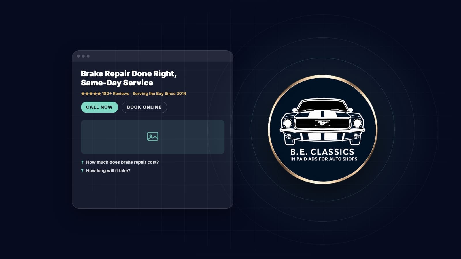
"Above the fold" just means visible without scrolling. Someone in a hurry, often on their phone, shouldn't have to go looking for how to contact you. A tap-to-call number and a single clear button, visible the instant the page loads, covers the two ways people actually convert.
One service, not your whole menu
A landing page for transmission repair should talk about transmission repair, not list every service you offer. That's what your main website is for, nobody clicking a transmission ad wants a guided tour of your tire rotation pricing too. A focused page answers exactly what the visitor came for and removes every other distraction competing for the click.
Trust signals, early and real
A new visitor from an ad doesn't know you yet. A star rating, a review count, or a line like "Serving [City] since [Year]" near the top does a lot of quiet work before they've read a single paragraph. Real numbers, not vague claims, carry the most weight here.
A few real photos
A photo of your actual shop, bay, or team outperforms a stock image every time, people are deciding whether to trust a real business, not admiring stock photography, and everyone's seen that one stock photo of a mechanic smiling at a clipboard a few too many times. Even an imperfect real photo beats a polished fake one.
Address the obvious objection
Every service has a question visitors are quietly asking before they call: "how much will this cost," "how long will it take," "do you use OEM parts." A short section addressing the one or two objections specific to that service removes the hesitation that would otherwise end at a closed tab instead of a phone call.
One call to action, repeated, not competing options
The whole page should point toward a single next step, "Call Now" or "Book Your Appointment," repeated at the top, middle, and bottom. Five different links fighting for attention convert worse than one clear action asked for several times, a dashboard with twelve warning lights helps nobody either.
Fast, and built for a phone screen
Most of this traffic arrives on a phone, often from someone standing in a parking lot. A page that loads in a couple seconds and doesn't require pinch-zooming to read beats a beautiful page that takes its time loading, patience is not a trait anyone brings to a cracked windshield.
A simple structure to follow
- Headline matching the ad, with the phone number and button right there
- A short line of trust (reviews, years in business, certifications)
- What's included in this specific service, in plain language
- A real photo or two
- The objection section, two or three questions answered briefly
- A final call to action, same as the top
One landing page isn't "done" forever
Once it's live, keep an eye on how it actually performs. If a service page gets plenty of clicks but very few calls, that's a sign something on the page, not the ad, is costing you conversions. Small changes, a clearer headline, a bigger button, a more specific photo, often move the number more than starting over from scratch.
Want a second set of eyes?
Building landing pages that actually convert is part of how we run campaigns, not an afterthought bolted on at the end. B.E. Classics builds Google and Facebook campaigns exclusively for auto repair shops, landing pages included, with clear reporting and no long-term contracts.
If you'd like a free look at how your current pages are converting, book a free Google audit below.